Zyan PErfumes
Home / Case Studies / Zyan Perfumes
ZAYN Perfumes
Ahmedabad, India
Client Background
The Challenge
The primary challenge was to build a distinctive brand identity in a perfume market already saturated with global and local players. I envisioned a short, bold name with cultural depth and sharp memorability. After nearly 20 days of exploration, we finalized ZAYN (from Arabic, meaning Grace). The four-letter structure gave the brand clarity and impact.
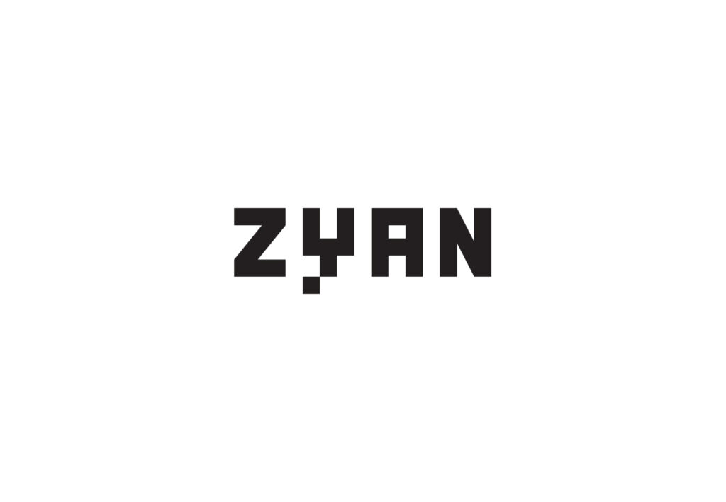
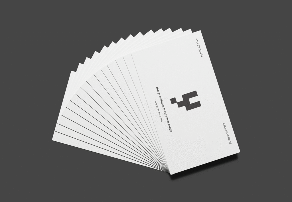
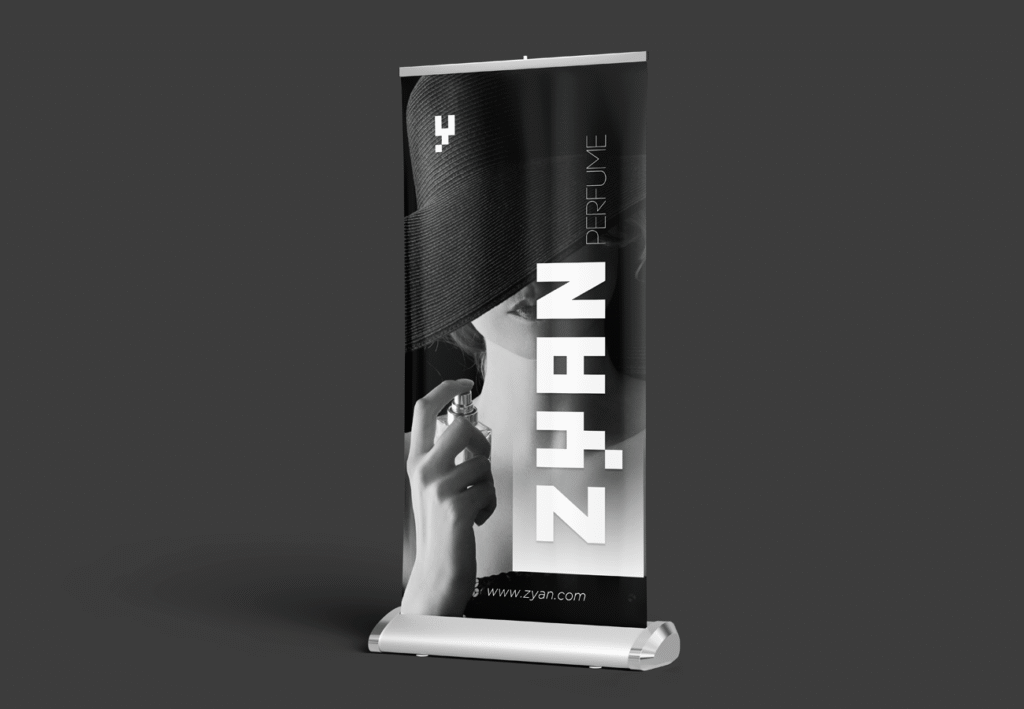
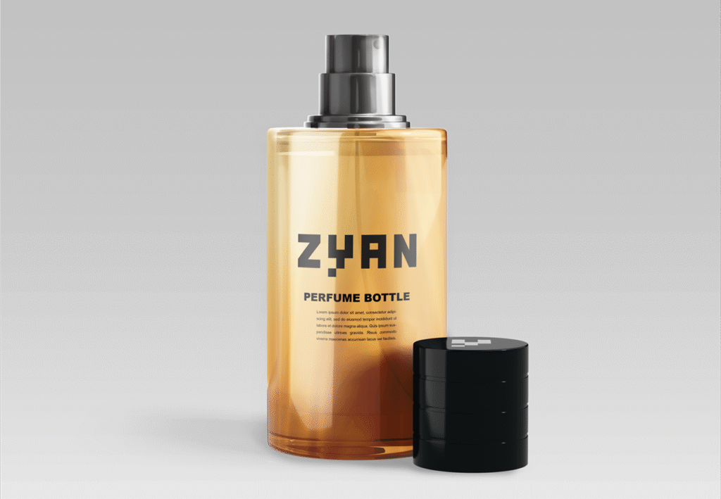
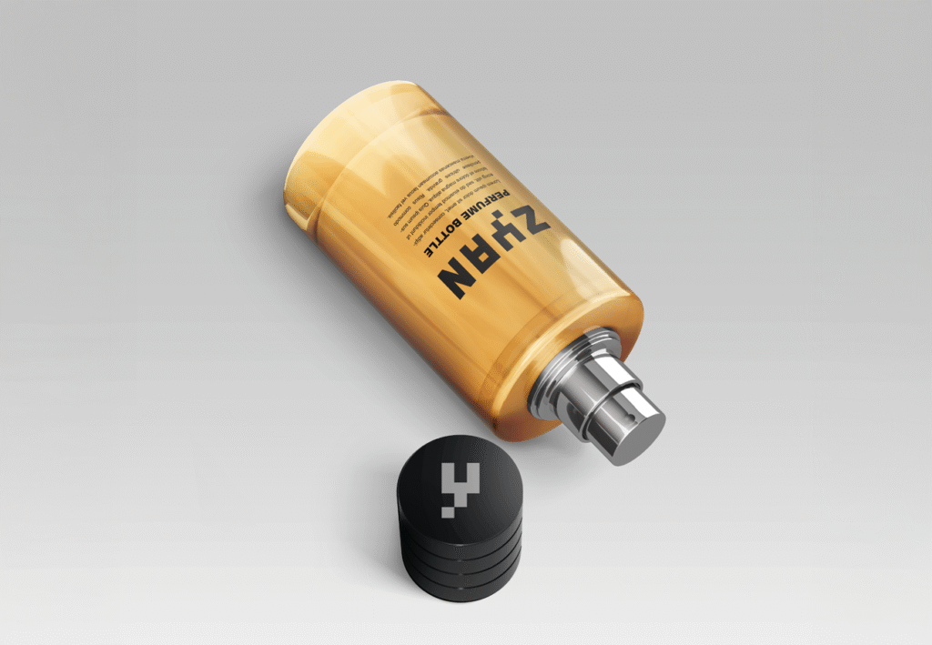
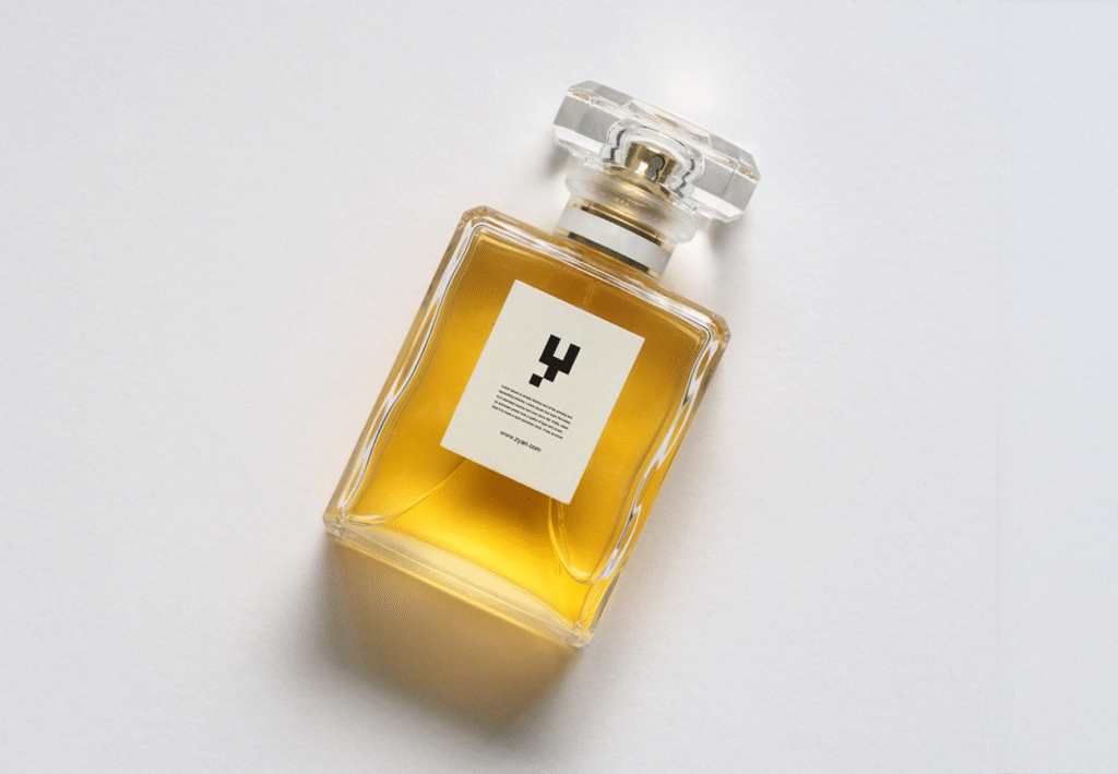
For the logo, we broke away from convention. Instead of emphasizing the first letter “Z,” we highlighted the “Y,” creating a subtle disruption that challenges traditional perfume brand identity norms. This typographic play gave the brand an unconventional edge and high recall value.
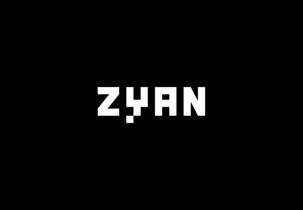
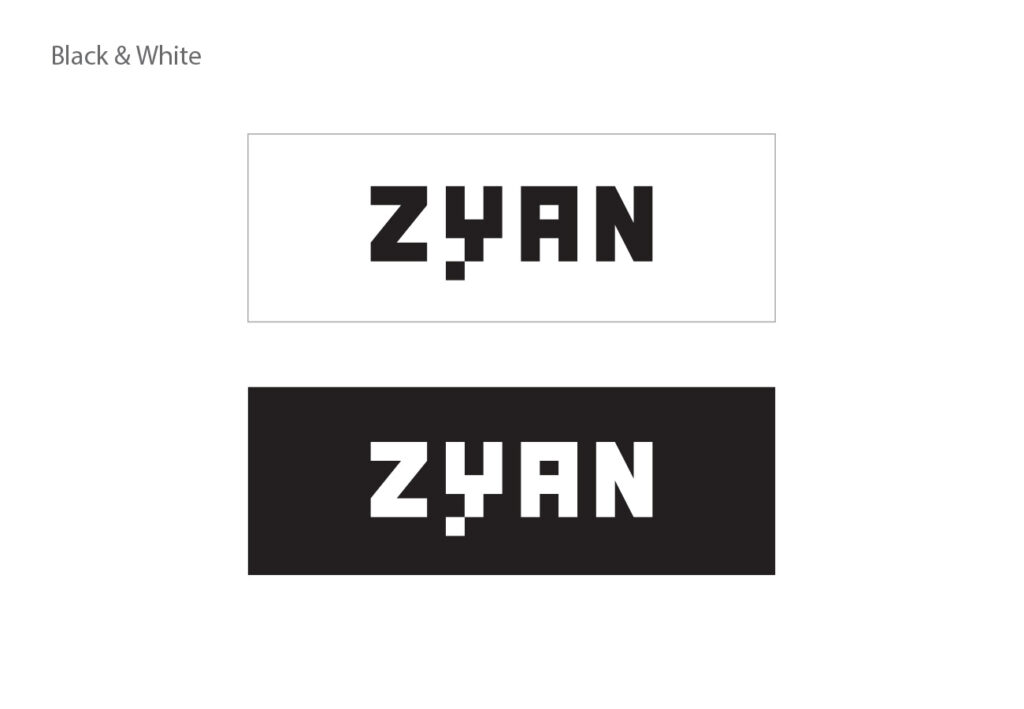
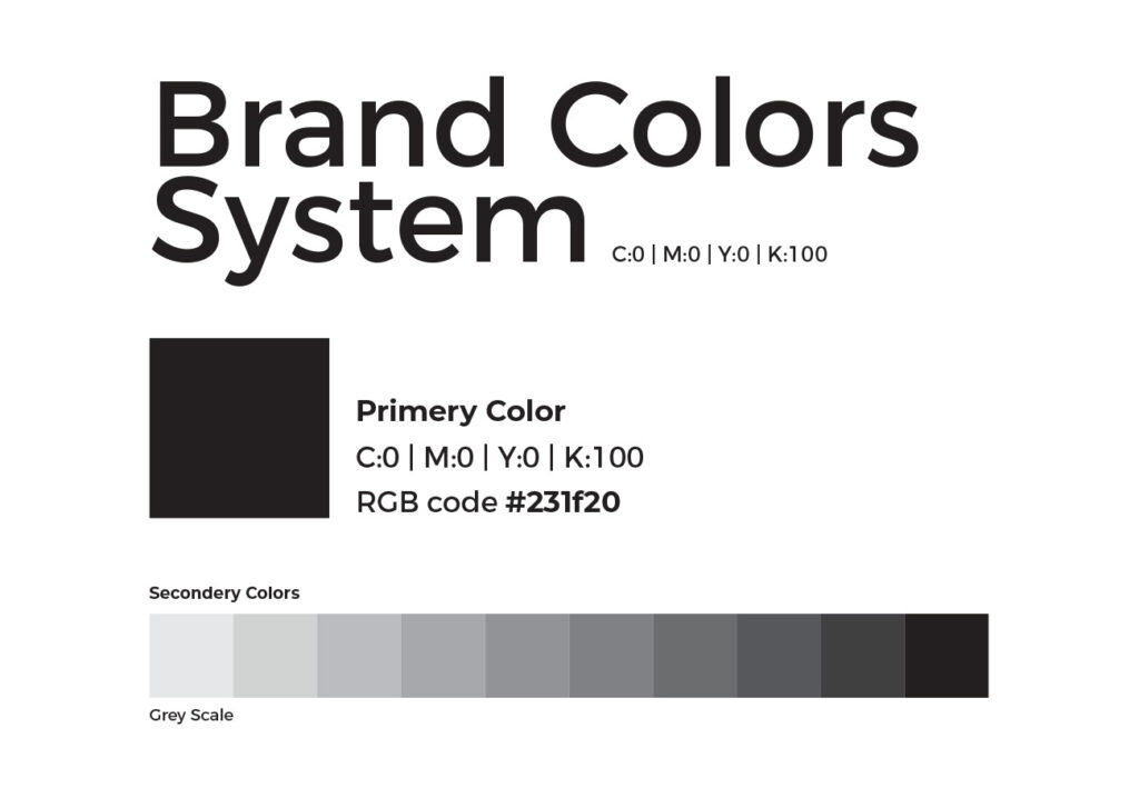
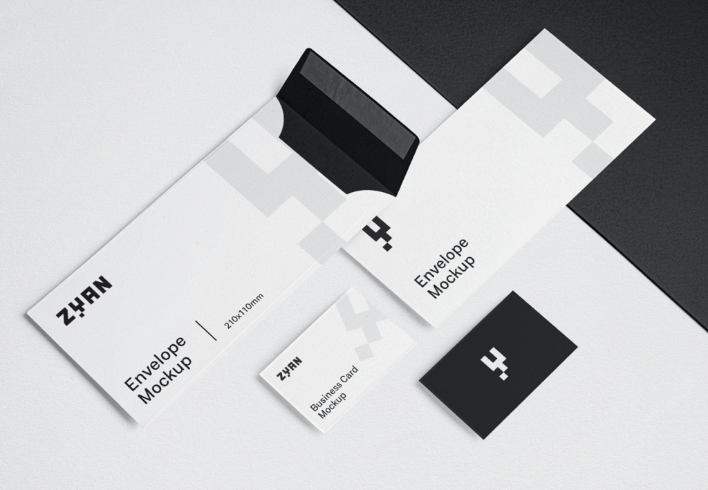
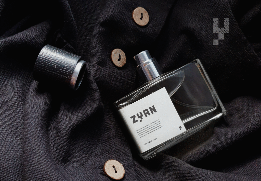
Equally deliberate was the choice of a black-and-white-only identity system. By stripping away color, the brand embraced what I call the “pure visual soul” of design — minimalism, sophistication, and timelessness without distraction.
Our Solution
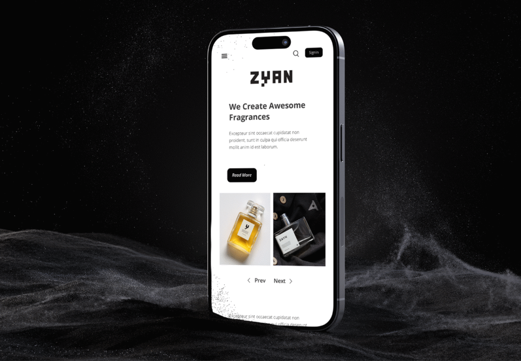
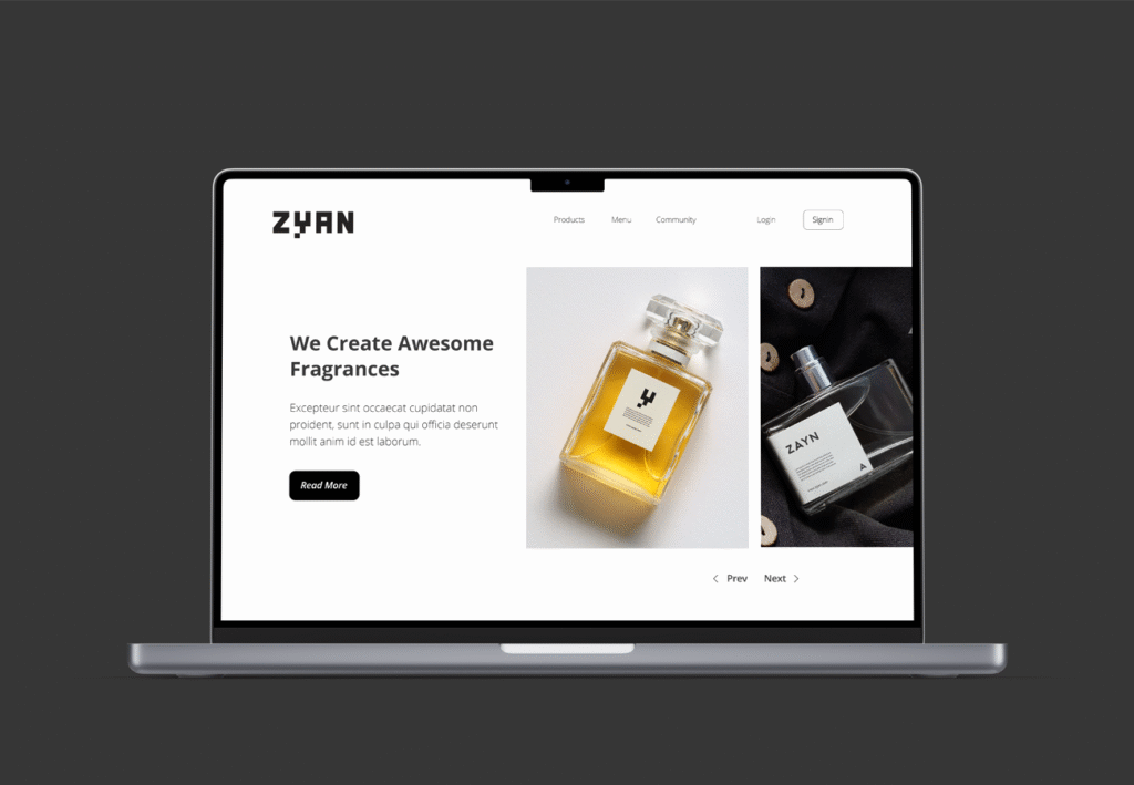
We built a typography-led identity system that reflected ZAYN’s philosophy of sophisticated modernism with a refined edge. The design direction ensured that the brand would stand out while remaining versatile across packaging, marketing, and digital environments. Every touchpoint reinforced a sense of poetry, grace, and bold simplicity.
Execution
- Crafted a typographic logo with emphasis on the unconventional “Y”
- Developed a minimal black-and-white color system rooted in elegance and timeless appeal
- Designed packaging systems with clean structures, refined finishes, and premium detailing
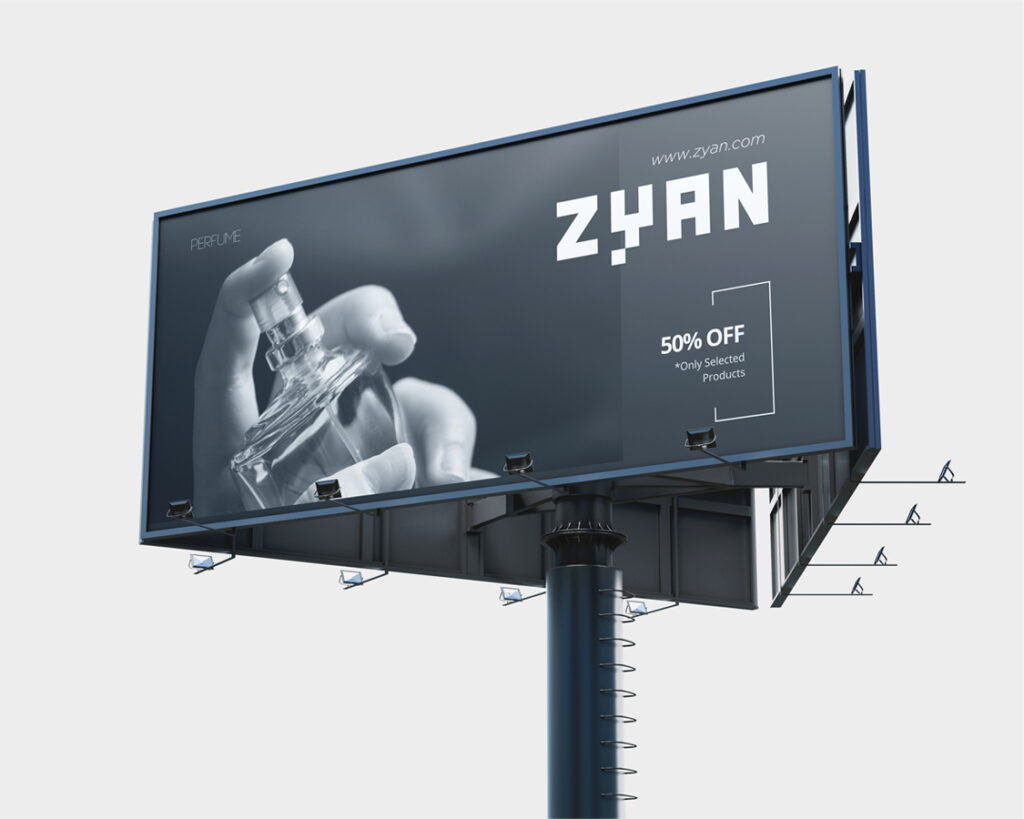
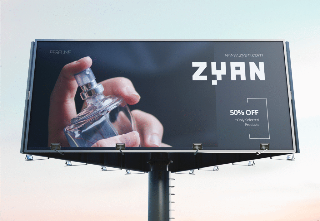
- Extended the visual identity across print, social media, campaigns, and digital assets
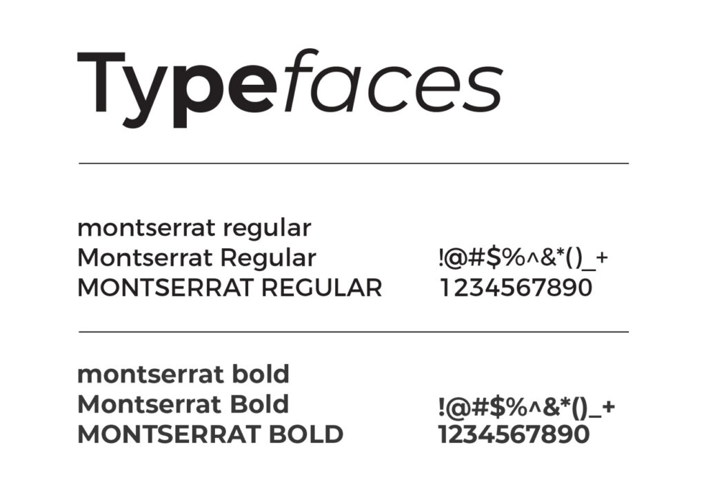
- Built a comprehensive brand guideline system to ensure consistent future application
Outcome
ZAYN Perfumes
Ahmedabad, India
Client Background
The Challenge
The primary challenge was to build a distinctive brand identity in a perfume market already saturated with global and local players. I envisioned a short, bold name with cultural depth and sharp memorability. After nearly 20 days of exploration, we finalized ZAYN (from Arabic, meaning Grace). The four-letter structure gave the brand clarity and impact.
For the logo, we broke away from convention. Instead of emphasizing the first letter “Z,” we highlighted the “Y,” creating a subtle disruption that challenges traditional perfume brand identity norms. This typographic play gave the brand an unconventional edge and high recall value.
Equally deliberate was the choice of a black-and-white-only identity system. By stripping away color, the brand embraced what I call the “pure visual soul” of design — minimalism, sophistication, and timelessness without distraction.
Our Solution
We built a typography-led identity system that reflected ZAYN’s philosophy of sophisticated modernism with a refined edge. The design direction ensured that the brand would stand out while remaining versatile across packaging, marketing, and digital environments. Every touchpoint reinforced a sense of poetry, grace, and bold simplicity.
Execution
- Crafted a typographic logo with emphasis on the unconventional “Y”
- Developed a minimal black-and-white color system rooted in elegance and timeless appeal
- Designed packaging systems with clean structures, refined finishes, and premium detailing
- Extended the visual identity across print, social media, campaigns, and digital assets
- Built a comprehensive brand guideline system to ensure consistent future application
